In this article, we are going to talk about IconButton and its tips and tricks. Before we begin, let’s identify the IconButton() widget, and why you should use it.
The IconButton() – is a button widget that displays an icon where user can tap on it and an action will be triggered. IconButtons are commonly used in app bars, toolbars, and any other part of the UI where you want to replace wording with nice visual interaction as they are small in size and can be easily placed throughout an app. You can customize the appearance of the IconButton, including custom material 3 icon, color, size and other styling to fit the design of your app.
Table of Contents
Initialization: IconButton()
You can initialize IconButton by adding it to any parent widget. The most important that IconButton widget has two required parameters:
- onPressed [void Function()?] – is a callback that triggers an action on button tap. This parameter can be set to null.
- icon [Widget] – is a widget that is being displayed in the UI.
Note: onPressed parameter can be set to null, and icon parameter is actually a Widget so it can be set as any custom widget, but this is not recommended.
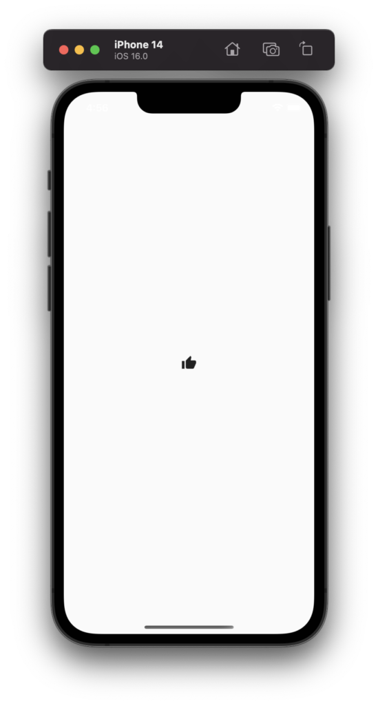
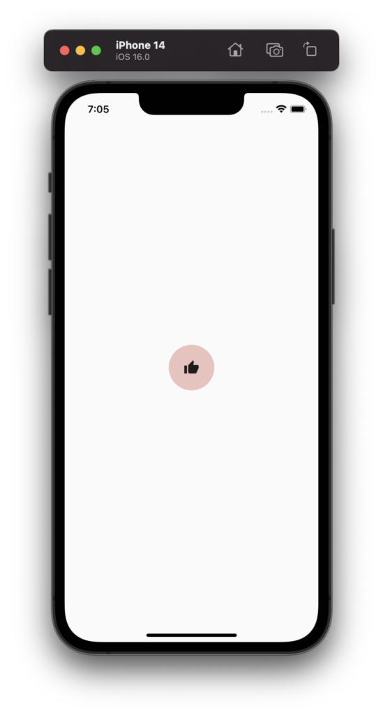
Let’s assume you want to create a thumbnail icon button. Todo so, you can type the code below:
IconButton(
  onPressed: () {},
  icon: const Icon(Icons.thumb_up),
),
And this is an result:
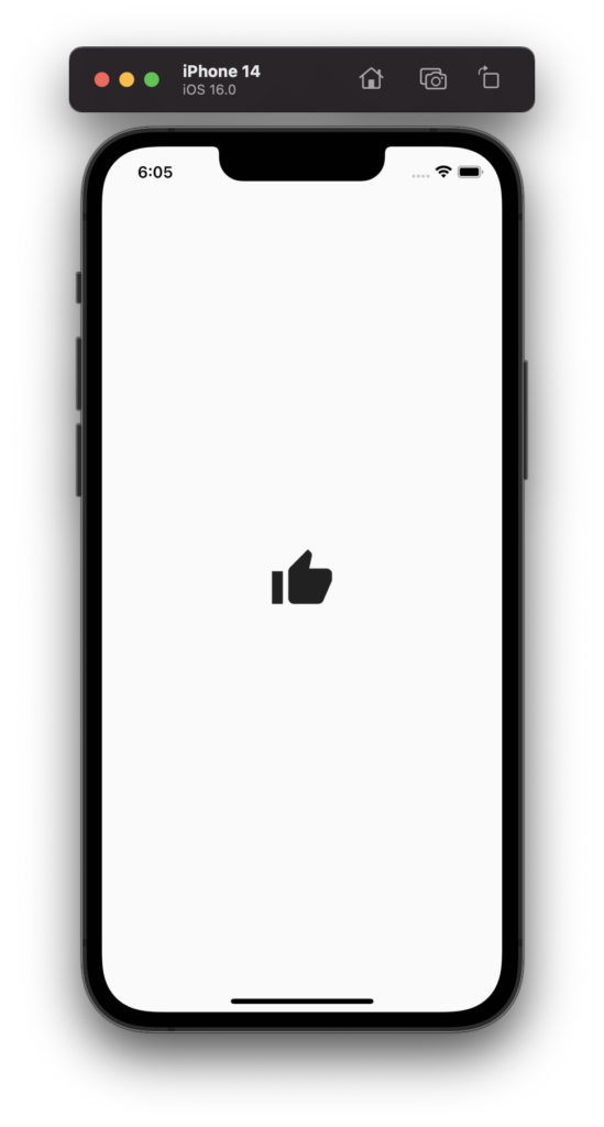
1. IconButton – iconSize
To change the icon size of the icon button, all you need is to set iconSize parameter.
double? iconSize – is a double parameter that changes the size of an icon. If null is set, the default value of 24.0 will be used.
Here is an example of changing an Icon size to 64.0:
IconButton(
  onPressed: () {},
  icon: const Icon(Icons.thumb_up),
  iconSize: 64.0,
),
Result:
2. IconButton – padding
To add or remove spaces around IconButton we can use the padding parameter.
EdgeInsetsGeometry? padding – is an EdgeInsetsGeometry parameter that adds or removes spaces around the widget, in our case IconButton. If null is set, the default parameter of EdgeInsets.all(8.0) will be used.
Here is a code example:
IconButton(
onPressed: () {},
icon: const Icon(Icons.thumb_up),
padding: const EdgeInsets.all(8),
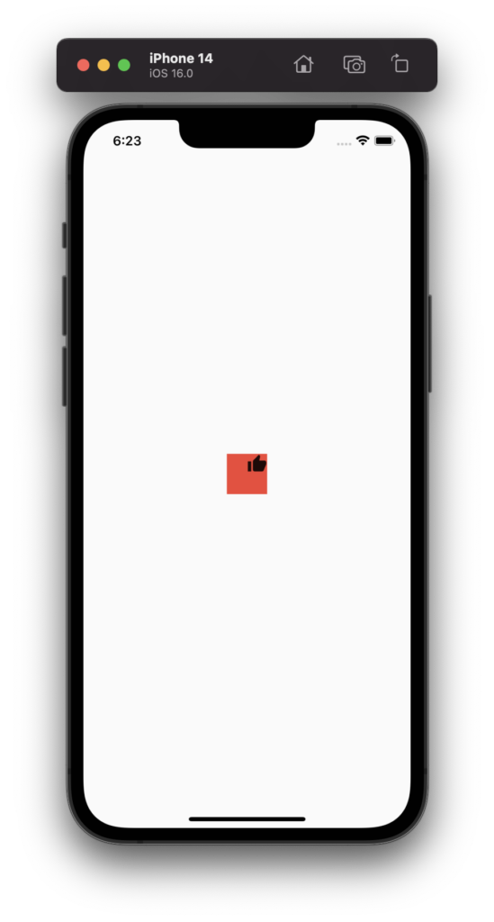
),3. IconButton – alignment
To change a position of an Icon within its size, we can use the alignment parameter.
AlignmentGeometry? alignment – is an AlignmentGeometry parameter that positions Icon within IconButton size. If null is set, the default parameter of Alignment.center will be used.
To illustrate where this feature will be useful, let’s combine it with the padding parameter of value zero and change the position of the icon to the top right side.
Here is a code example:
Container(
  color: Colors.red,
  child: IconButton(
    onPressed: () {},
    icon: const Icon(Icons.thumb_up),
    padding: EdgeInsets.zero,
    alignment: Alignment.topRight,
  ),
),
Result:
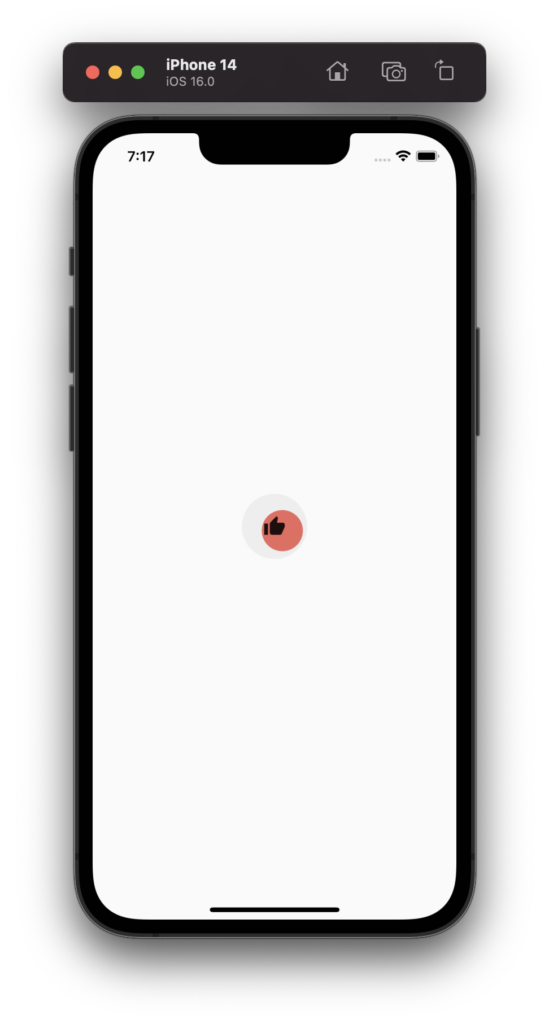
4. IconButton – splashRadius
In order to change the size of a splash radius when you click or press on IconButton, we can use splashRadius parameter.
double? splashRadius – is a double parameter that changes a radius of a splash effect. If null is set, the default value of 35.0 will be used.
Note: If the ThemeData useMaterial3 property is set to true, this parameter will be ignored.
Here is a code example of changing a splash radius to a bigger size of 54.0:
IconButton(
  onPressed: () {},
  icon: const Icon(Icons.thumb_up),
  splashRadius: 54,
),
Result:

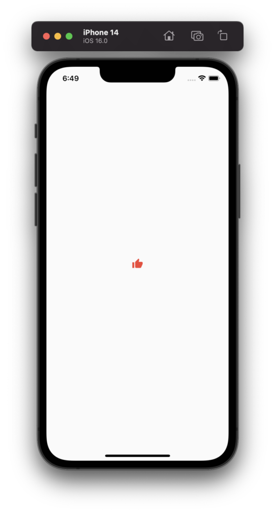
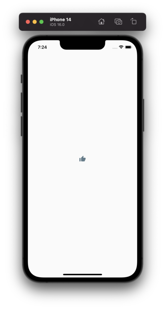
5. IconButton – color
To change a color of an Icon, we can use the color parameter.
Color? color – is a Color parameter that used to specify an Icon color. If null is set, the default color of Theme.of(context).iconTheme.color will be used.
Here is a code example of changing Icon color to red:
IconButton(
  onPressed: () {},
  icon: const Icon(Icons.thumb_up),
  color: Colors.red,
),
Result:
6. IconButton – highlightColor
To change the color of a highlight effect in the icon button (when pressing and holding the button), we can use highlightColor property.
Color? highlightColor – is a Color property that changes the color of a highlighted radius effect. If null is set, the default value of ThemeData.highlightColor will be set.
Here is an example of changing the highlight color to red with 30% opacity:
IconButton(
  onPressed: () {},
  icon: const Icon(Icons.thumb_up),
  highlightColor: Colors.red.withOpacity(0.3),
),
Result:
6. IconButton – splashColor
To change the color of a splash effect in the icon button (start with a point where a button was pressed), we can use the splashColor property.
Color? splashColor – is a Color property that changes the color of a splash radius effect. If null is set, the default value of ThemeData.splashColor will be set.
Here is an example of changing splash color to red:
IconButton(
  onPressed: () {},
  icon: const Icon(Icons.thumb_up),
  splashColor: Colors.red,
),
Result:
7. IconButton – disabledColor
To change the color of an icon button when IconButton is disabled, we can use disabledColor property.
Color? disabledColor – is a Color property that changes the color of an Icon when IconButton is disabled. If null is set, the default value of ThemeData.disabledColor will be used.
Note: In order to disable an IconButton, we need to set onPressed property to null.
Here is an example of changing the disabled color to Blue-grey:
IconButton(
  onPressed: null,
  icon: const Icon(Icons.thumb_up),
  disabledColor: Colors.blueGrey,
),
Result:
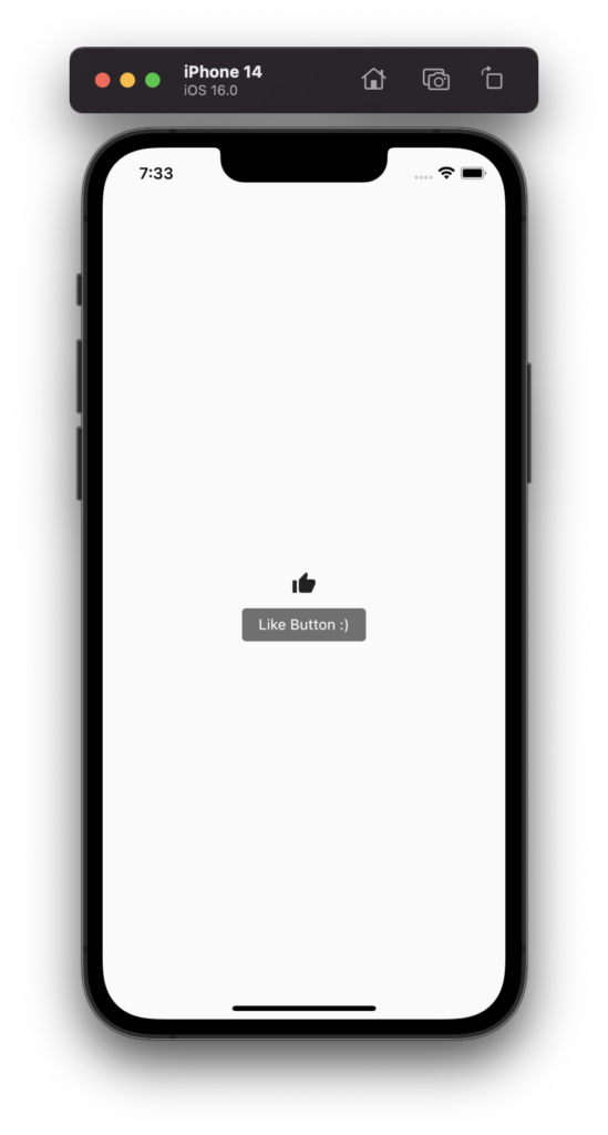
8. IconButton – tooltip
For accessibility, the tooltip parameter can be used with custom text. This will help to identify an action with a long press of the button.
String? tooltip – is a String value property that allows you to describe the action when the user long-presses on the button. If null is set, nothing will be shown.
Here is an example of adding a custom text to IconButton tooltip:
IconButton(
  onPressed: () {},
  icon: const Icon(Icons.thumb_up),
  tooltip: 'Like Button :)',
),
Result:
9. IconButton – isSelected and selectedIcon
With new material 3, IconButton now has two more awesome parameters: isSelected and selectedIcon.
bool? isSelected – is a boolean parameter (true or false) whether IconButton has been selected or not.
Widget? selectedIcon – is a Widget parameter (icon in general being used) that is displayed when the isSelected parameter is set to true.
Note: ThemeData useMaterial3 property should be set to true, otherwise isSelected and selectedIcon parameters will be ignored.
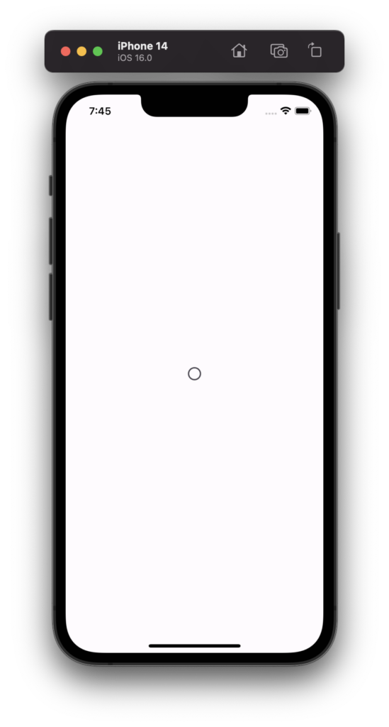
Here is a code example for both cases. Let’s assume that we have some logic implemented, and IconButton has not been selected yet. (Circle Icon)
IconButton(
  onPressed: () {},
  icon: const Icon(Icons.circle_outlined),
  isSelected: false,
  selectedIcon: const Icon(Icons.circle),
),
The result will be this:
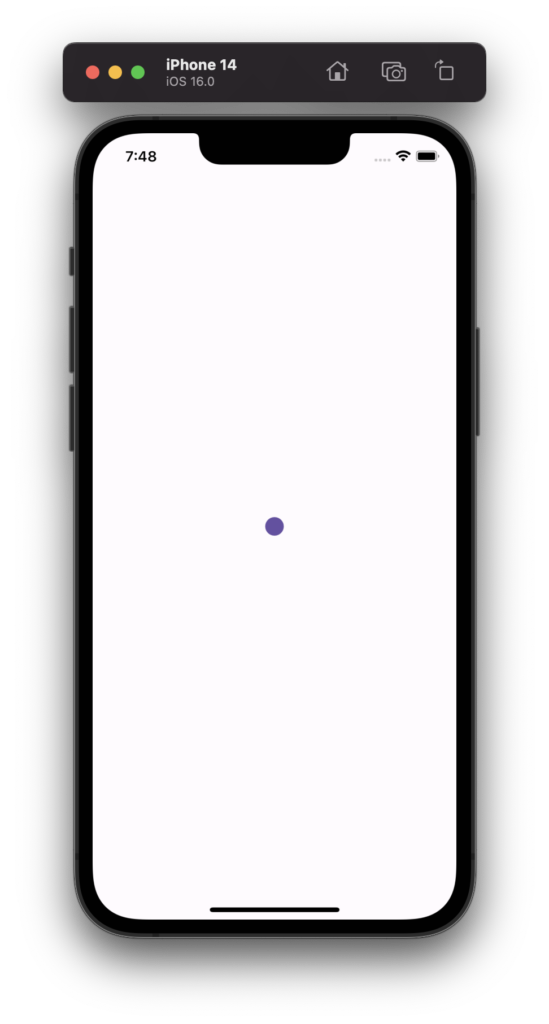
Now, assuming that Icon has been selected, so we will set the parameter to true. Then, selectedIcon will be triggered and displayed.
IconButton(
  onPressed: () {},
  icon: const Icon(Icons.circle_outlined),
  isSelected: true,
  selectedIcon: const Icon(Icons.circle),
),
Result:
This is pretty much it for the Tips and Tricks of IconButton(). Thanks for reading! Leave a comment bellow.
