

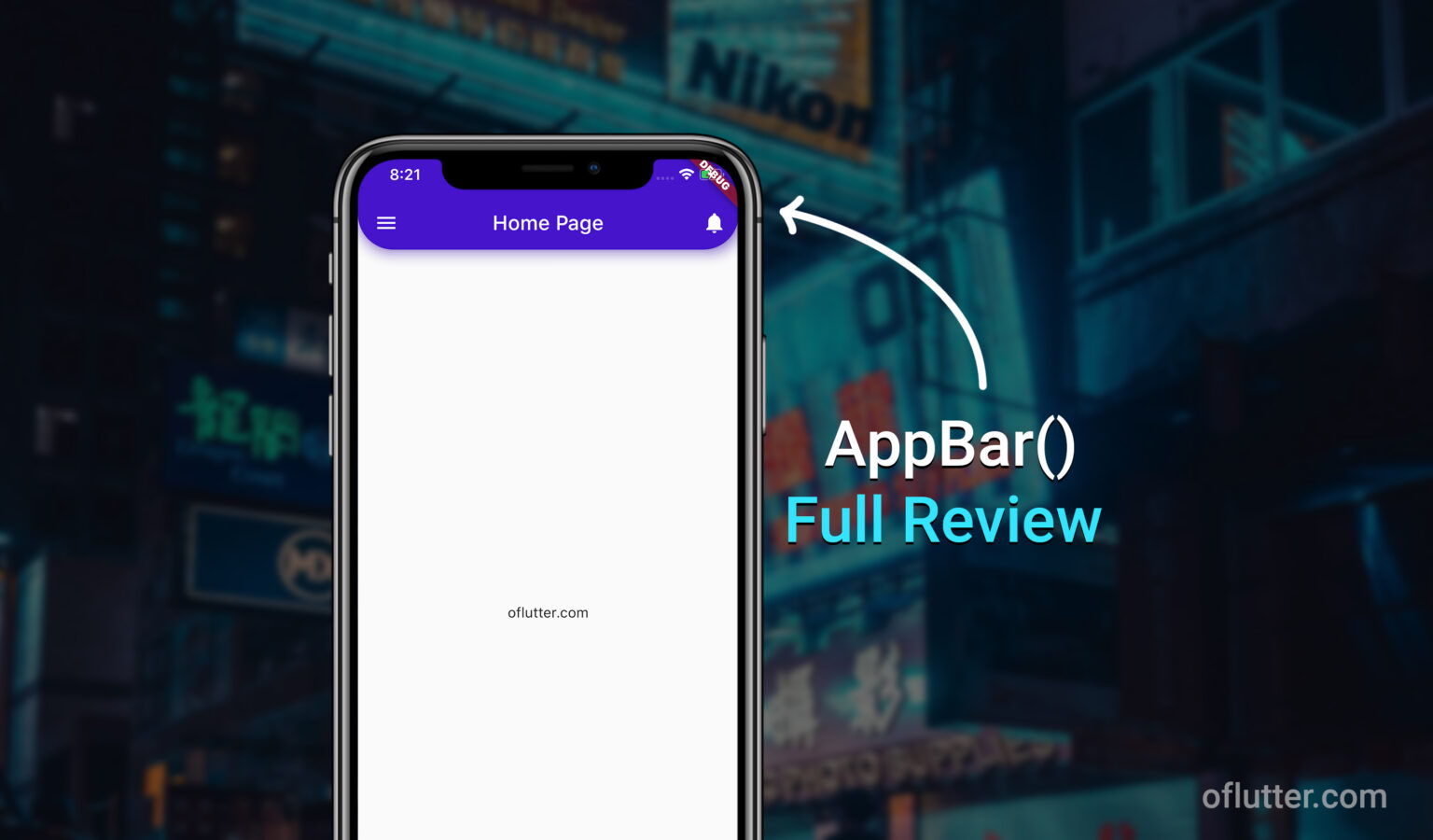
Flutter AppBar is one of the main widgets that more than 95% of developers are going to use it. In this article, I will explain to you the most common and useful properties of flutter’s AppBar() with code examples and results.
AppBar has 28 properties in total by the date of this post-release (it might be more in the future).
Table of Contents
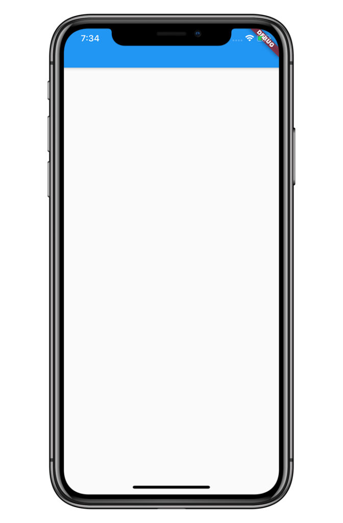
1. AppBar() – Initialization
You can initialize AppBar by adding the widget appBar to Scaffold(). It will add a blue bar on top of the view screen, where you can place many proprieties. We are going to discuss all properties the next steps.
Code example:
return Scaffold(
  appBar: AppBar(),
);
Result:

As you can see, when we place appBar: AppBar() inside Scaffold, it automatically displayed a blue bar on top of the screen. The blue color is a default color, you can always override it inside AppBar or ThemeData() widget as well.
Now, we are going to discuss the most common and useful properties of flutter’s AppBar().
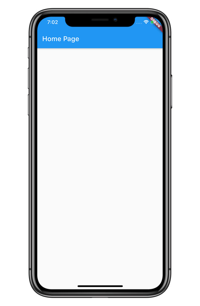
2. AppBar() – title
– is used for identifying a current page name. Usually, it’s using a Text() widget to display the name of the page.
For example, let’s assume we want to name our page as a ‘Home Page’. Then, we can easily put Text(‘Home Page’) inside our title widget.
Code example:
return Scaffold(
  appBar: AppBar(
    title: Text('Home Page'),
  ),
);
Result:

Note: title property is a widget, so you can add any other widgets inside the title if you want.
3. AppBar() – leading
– is a widget that is displayed before a Title widget. Usually, it’s an IconButton() that allows a user to navigate to another page.
For example, the leading widget can be a menu widget.
Code example:
return Scaffold(
  appBar: AppBar(
    leading: IconButton(
      icon: Icon(Icons.menu),
      onPressed: () => print('Your Route'),
    ),
  ),
Result:

Note: You should replace print(‘Your Route’) with your own function.
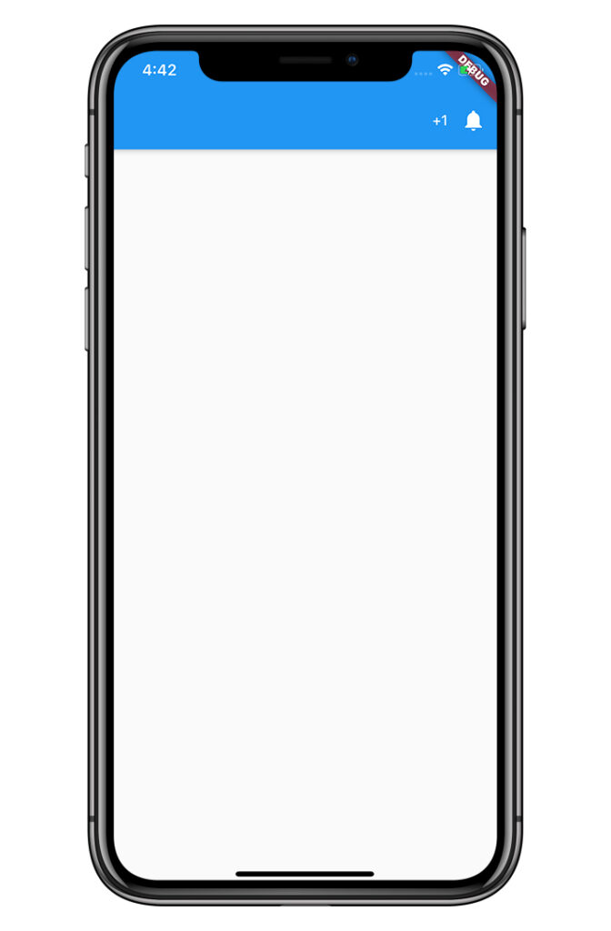
4. AppBar() – actions
– is a widget that is displayed after a Title widget. Usually, it’s an IconButton() that allows a user to add more actions in app.
For example, actions allow creating more than one widget so the actions widgets can be an IconButton and/or Text.
Code example:
return Scaffold(
  appBar: AppBar(
    actions: [
      Center(
        child: Text('+1'),
      ),
      IconButton(
        icon: Icon(Icons.notifications),
        onPressed: () => null,
      ),
    ],
  ),
  body: Center(),
);
Result:
5. AppBar() – bottom
– is a widget that is displayed at the bottom of an AppBar. Usually, it’s a TabBar() widget that allows you to add action icons across AppBar.
For example, let’s assume you have a map that calculate distance and time for cars, metro, and bicycle. Then, you can use TabBar with TabBarView in body widget and have multiple scene in one screen.
Code example:
return DefaultTabController(
  length: 3,
  child: Scaffold(
    appBar: AppBar(
      bottom: TabBar(
        tabs: [
          Tab(icon: Icon(Icons.directions_car)),
          Tab(icon: Icon(Icons.directions_transit)),
          Tab(icon: Icon(Icons.directions_bike)),
        ],
      ),
    ),
    body: TabBarView(
      children: [
        Center(
          child: Text('Car Map'),
        ),
        Center(
          child: Text('Metro Map'),
        ),
        Center(
          child: Text('Bicycle Map'),
        ),
      ],
    ),
  ),
);
Result:

Note: You have to return DefaultTabController with a specified length instead of Scaffold. There should be the same amount of tabs in TabBar and TabBarView.
6. AppBar() – elevation
– is a number that allows you to change the bottom shadow in AppBar. By default, an elevation is equal to 4.
For example, we can remove the bottom shadow of an AppBar by settings elevation to 0 or increase shadow by choosing a higher number than 4.
Code example:
return Scaffold(
  appBar: AppBar(
    elevation: 20.3,
  ),
  body: Center(),
);
Result:

7. AppBar() – shadowColor
– is a color that allows you to change a color of the bottom shadow in.
For example, you can use Colors.red as a parameter of shadowColor to change the default color of a bottom shadow.
Code example:
return Scaffold(
  appBar: AppBar(
    shadowColor: Colors.red,
  ),
  body: Center(),
);
Result:

Note: The best practice is to use it with elevation. You can also use Color.fromRGBO(r, g, b, opacity) to specify the exact color match.
8. AppBar() – shape
– is the shape of the AppBar. You can change a shape by using ShapeBorder.lerp().
For example, let’s assume we want to have a rounded corners. Then, we can use ShapeBorder.lerp with RoundedRectangleBorder.
Code example:
return Scaffold(
  appBar: AppBar(
    shape: ShapeBorder.lerp(
      RoundedRectangleBorder(
        borderRadius: BorderRadius.circular(40.0),
      ),
      null,
      0,
    ),
  ),
  body: Center(),
);
Result:

9. AppBar() – backgroundColor
– is a background color of the AppBar. You can change the background color by using Colors class.
For example, let’s assume that we want to change our background color to purple. Then, we can use backgroundColor: Colors.purple
Code example:
return Scaffold(
  appBar: AppBar(
    backgroundColor: Colors.purple
  ),
  body: Center(),
);
Result:

10. AppBar() – iconTheme
– is a color, opacity, and size of all Icons of the AppBar. Instead of manually changing color, opacity, or sizes for all Icons, you can change them all by using IconThemeData.
For example, if we want to change Icons color to yellow, and size to 40. Then, we can use IconThemeData with parameters (color: Colors.yellow, opacity: 1, size: 40).
Code example:
return Scaffold(
  appBar: AppBar(
    iconTheme: IconThemeData(color: Colors.yellow, opacity: 1, size: 40),
    leading: Icon(Icons.people),
  ),
  body: Center(),
);
Result:

10. AppBar() – centerTitle
– is a true/false for centralizing title. By default, the title widget is placed in the center. You can change it by setting centerTitle to false.
For example, if you do not want to have a title in the center, then you can set centerTitle: false
Code example:
return Scaffold(
  appBar: AppBar(
    title: Text('Home Page'),
    centerTitle: false
  ),
  body: Center(),
);
Result:
11. AppBar() – toolbarHeight
– is the height of the AppBar tools. You can increase or decrease the height of the AppBar by changing the value of toolbarHeight. By default, it’s 56.
For example, if you want to decrease AppBar’s height, then you can use toolbarHeight: [double num].
Code example:
return Scaffold(
  appBar: AppBar(
    toolbarHeight: 30,
  ),
  body: Center(),
);
Result:
Conclusion
I showed you 10 of the most common and useful widgets with parameters in AppBar(). Of course, there are more parameters, but you might never even use them at all. I hope this article was helpful to you, and you learned sufficient new material about AppBar in Flutter.
Leave a comment below if you have any questions.
P.S This article will be updated from time to time if new widgets/parameters appear in Flutter AppBar. Also, you can read full official documentation here: read more


Thank soo much
this site so helpful
You are welcome 🙂