
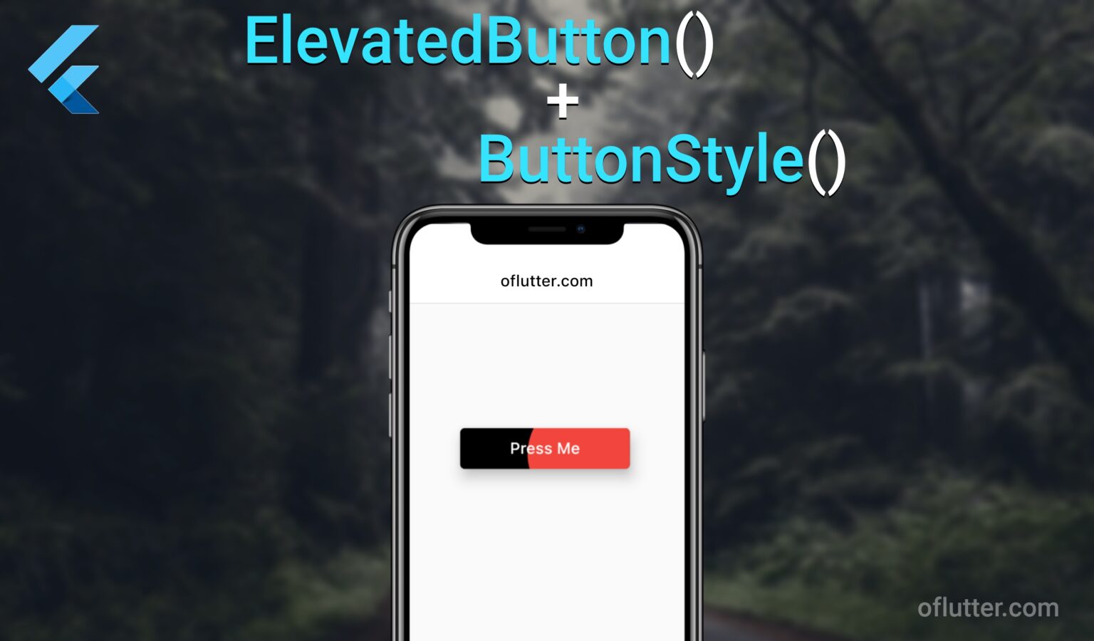
ElevatedButton widget is one of the most common button types in the Flutter framework. Thus, in this tutorial, we will learn how to style an elevated button using the ButtonStyle and its properties.
Table of Contents
ElevatedButton – Initialization
To create an Elevated button widget, we simply have to assign ElevatedButton() widget child of any parent widgets. In this example, we will assign it to Center widget.
Scaffold(
  body: SafeArea(
    child: Center(
      child: ElevatedButton(
        onPressed: () {},
        child: const Text('My Button'),
      ),
    ),
  ),
),
The output should look like this

ElevatedButton – onPressed
– is a function that allows you to create any logical events which will be triggered when a user presses the button.
For example, if we want to print some information on the console, we would simply call the print() method inside out onPressed function.
ElevatedButton(
  onPressed: () {
    print('oflutter.com - the best website to learn flutter');
  }
)Note: onPressed parameter is a required field, but it can be nullable as well.
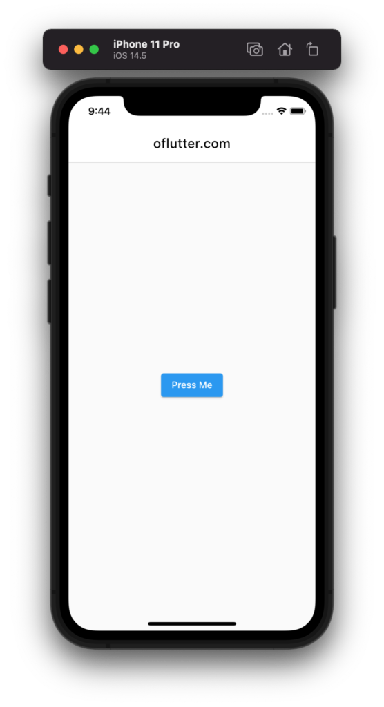
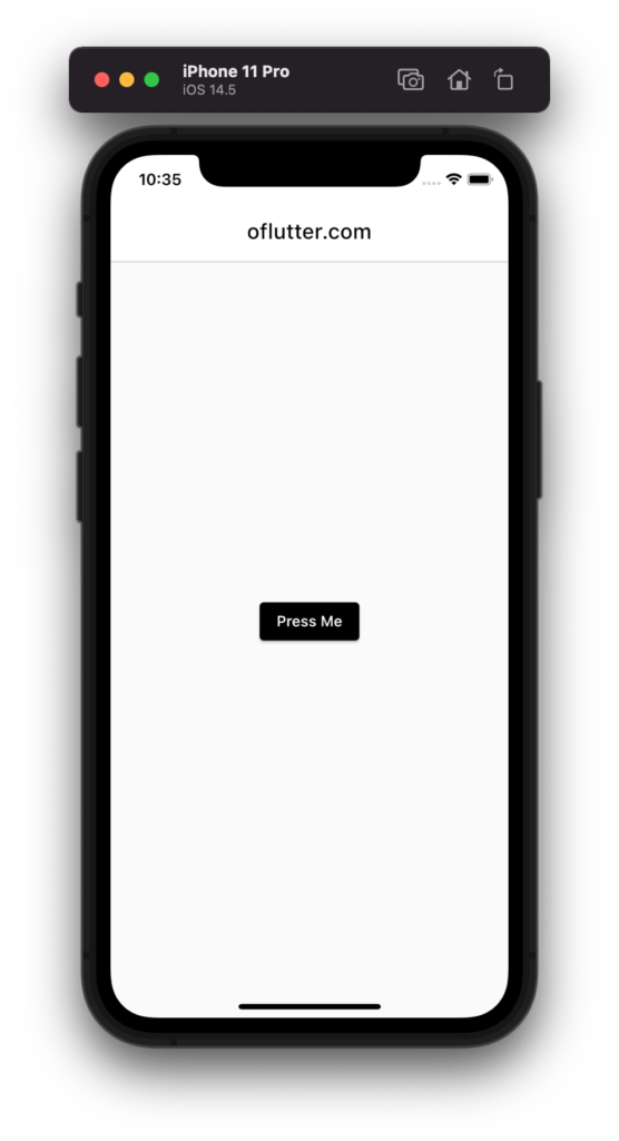
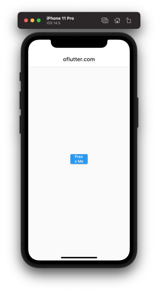
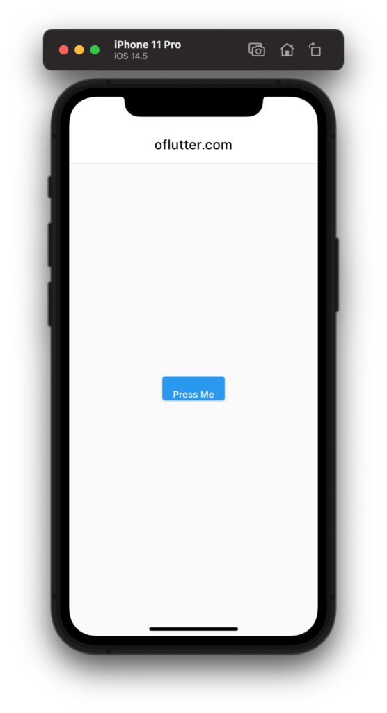
ElevatedButton – child
– is a child widget that should be defined inside the elevated button widget. Usually, the child widget is a Text() widget that defines the title of a button.
For instance, we can add const Text widget with ‘Press Me’ title as a button name.
ElevatedButton(
  child: const Text('Press Me'),
),
The output should look like this:
Note: child parameter is a required field, but it can be nullable as well.
ElevatedButton – onLongPress
– is a function that allows you to create any logical events which will be triggered when a user presses and hold the button for some time.
For example, if we want to print some information on the console when we on long press, we would simply call the print() method inside out onLongPress function.
ElevatedButton(
  onLongPress: () {
    print('oflutter.com - the best website to learn flutter');
  }
)
Fact: You can use both onPressed and onLongPress at the same time.
ElevatedButton – style
– is a parameter that allows you to create any styles you want for your button Widget
This is a very commonly used parameter as it allows you to customize e.g elevated buttons accordingly to your app layout
ElevatedButton(
  style: ButtonStyle(),
)
ButtonStyle has more than 19 parameters, this includes but is not limited to:
- textStyle
- backgroundColor
- foregroundColor
- overlayColor
- shadowColor
- elevation
- padding
- minimumSize
- fixedSize
- maximumSize
- shape
- mouseCursor
- visualDensity
- tapTargetSize
- animationDuration
- enableFeedback
- alignment
- splashFactory
Let’s now go deep into the button style and explore its parameters.
MaterialStateProperty<TextStyle?>? textStyle
– is a parameter that allows you to style a child Text widget.
For example, if we want to increase a font size of an elevated button, we could you this property like this:
ElevatedButton(
  onPressed: () {},
  child: const Text('Press Me'),
  style: ButtonStyle(
    textStyle: MaterialStateProperty.all(
      const TextStyle(fontSize: 23),
    ),
  ),
Output:

MaterialStateProperty<Color?>? backgroundColor
– is a parameter that allows you to change the background color of an elevated button.
Example: Let’s assume we want to change the background color of our elevated button to black color. To do so, we simply set MaterialStateProperty.all(Colors.black) to a backgroundColor parameter.
ElevatedButton(
  onPressed: () {},
  child: const Text('Press Me'),
  style: ButtonStyle(
    backgroundColor: MaterialStateProperty.all(Colors.black),
  ),
),
Output:
MaterialStateProperty<Color?>? foregroundColor
– is a parameter that allows you to change the color of a child widget (Text and/or Icon).
Example: Let’s assume we want to change the text color of our elevated button “Press Me” to Green Accent. To do so, we simply set MaterialStateProperty.all(Colors.greenAccent) to a foregroundColor parameter.
ElevatedButton(
  onPressed: () {},
  child: const Text('Press Me'),
  style: ButtonStyle(
    foregroundColor: MaterialStateProperty.all(Colors.greenAccent),
  ),
),
Output:

Note: This parameter is best if you want to change a default color of Text() widget or Icon() widget
MaterialStateProperty<Color?>? overlayColor
– is a parameter that allows you to change the color of a button when it’s being focused, hovered, or pressed.
Example: Let’s assume we want to change the splash color to red when we press an elevated button. To do so, we simply set MaterialStateProperty.all(Colors.red) to a overlayColor parameter.
ElevatedButton(
  onPressed: () {},
  child: const Text('Press Me'),
  style: ButtonStyle(
    overlayColor: MaterialStateProperty.all(Colors.red),
  ),
),
Output:

MaterialStateProperty<Color?>? shadowColor
– is a parameter that allows you to change the color of shadow on a button.
Example: Let’s assume we want to change the shadow color to red. To do so, we simply set MaterialStateProperty.all(Colors.red) to a shadowColor parameter.
ElevatedButton(
  onPressed: () {},
  child: const Text('Press Me'),
  style: ButtonStyle(
    shadowColor: MaterialStateProperty.all(Colors.red),
  ),
),
Output:
MaterialStateProperty<double?>? elevation
– is a parameter that allows you to increase or decrease the amount of shadow (elevation).
Example: Let’s assume we want to increase the amount of shadow on the button. To do so, we simply set MaterialStateProperty.all(15) to an elevation parameter.
ElevatedButton(
  onPressed: () {},
  child: const Text('Press Me'),
  style: ButtonStyle(
    elevation: MaterialStateProperty.all(15),
  ),
),
Output:
MaterialStateProperty<EdgeInsetsGeometry?>? padding
– is a parameter that allows you to increase or decrease the amount of space between button’s boundary and its child.
Example: Let’s assume we want to increase space between Text widget and button’s boundary. To do so, we simply set MaterialStateProperty.all(const EdgeInsets.all(20)) to a padding parameter.
ElevatedButton(
  onPressed: () {},
  child: const Text('Press Me'),
  style: ButtonStyle(
    padding: MaterialStateProperty.all(const EdgeInsets.all(20)),
  ),
),
Output:

MaterialStateProperty<Size?>? minimumSize
– is a parameter that allows you to set a minimum size (height and width) of the button.
Example: Let’s assume we want to set a minimum width for our elevated button to 200 and the height to 40. To do so, we simply set MaterialStateProperty.all(const Size(200, 40)) to a minimumSize parameter.
ElevatedButton(
  onPressed: () {},
  child: const Text('Press Me'),
  style: ButtonStyle(
    minimumSize: MaterialStateProperty.all(const Size(200, 40)),
  ),
),
Output:
Note: minimumSize cannot be greater then a maximumSize
MaterialStateProperty<Size?>? maximumSize
– is a parameter that allows you to set a maximum size (height and width) of the button.
Example: Let’s assume we want to set a maximum width for our elevated button to 64 and the height to 36. To do so, we simply set MaterialStateProperty.all(const Size(64, 36)) to a maximumSize parameter.
ElevatedButton(
  onPressed: () {},
  child: const Text('Press Me'),
  style: ButtonStyle(
    maximumSize: MaterialStateProperty.all(const Size(64, 36)),
  ),
),
Output:
Note: maximumSize cannot be less then a minimumSize
MaterialStateProperty<Size?>? fixedSize
– is a parameter that allows you to set a fixed size (height and width) of the button.
Unlike minimumSize and maximumSize – fixedSize is a constant parameter, so the size of a button will not be responsively changed e.g depends on the resolution screen.
Example: Let’s assume we want to set a fixed width for our elevated button to 200 and a fixed height to 40. To do so, we simply set MaterialStateProperty.all(const Size(200, 40)) to a fixedSize parameter.
ElevatedButton(
  onPressed: () {},
  child: const Text('Press Me'),
  style: ButtonStyle(
    fixedSize: MaterialStateProperty.all(const Size(200, 40)),
  ),
),
Output:
MaterialStateProperty<BorderSide?>? side
– is a parameter that allows you change a border color and width of a button.
Example: Let’s assume we want to make a red border color for a button and increase size (width) to 2. To do so, we simply set MaterialStateProperty.all(const BorderSide( color: Colors.red, width: 2 )) to a side parameter.
ElevatedButton(
  onPressed: () {},
  child: const Text('Press Me'),
  style: ButtonStyle(
    side: MaterialStateProperty.all(
      const BorderSide(
        color: Colors.red,
        width: 2,
      ),
    ),
  ),
),
Output:

MaterialStateProperty<OutlinedBorder?>? shape
– is a parameter that allows you to change a shape of a button. For example, make rounded corners.
Example: Let’s assume we want to make a rounded corners for a button. To do so, we simply set MaterialStateProperty.all( RoundedRectangleBorder( borderRadius: BorderRadius.circular(30))), to a shape parameter.
ElevatedButton(
  onPressed: () {},
  child: const Text('Press Me'),
  style: ButtonStyle(
    shape: MaterialStateProperty.all(
      RoundedRectangleBorder(
        borderRadius: BorderRadius.circular(30),
      ),
    ),
  ),
),
Output:

VisualDensity? visualDensity
– is a parameter that defines how compact the button’s layout will be.
Example: Let’s assume we want to returns a visual density that is adaptive based on the TargetPlatform. To do so, we set VisualDensity.adaptivePlatformDensity, to a visualDensity parameter.
ElevatedButton(
  onPressed: () {},
  child: const Text('Press Me'),
  style: ButtonStyle(
    visualDensity: VisualDensity.adaptivePlatformDensity,
  ),
),
For more information about visual density – you can lear here: visualDensity
MaterialTapTargetSize? tapTargetSize
– is a parameter that configures the minimum size of the area within which the button may be pressed.
Example: Let’s assume we want to shrinks the tap target size to the minimum. To do so, we set MaterialTapTargetSize.shrinkWrap, to a tapTargetSize parameter.
ElevatedButton(
  onPressed: () {},
  child: const Text('Press Me'),
  style: ButtonStyle(
    tapTargetSize: MaterialTapTargetSize.shrinkWrap,
  ),
),
Duration? animationDuration
– is a parameter that sets a duration (speed) of animated changes for shape and elevation.
Example: Let’s assume we want to increase a speed of animation for shape and elevation to 100 milliseconds when a button is being pressed. To do so, we set Duration(milliseconds: 100), to a animationDuration parameter.
ElevatedButton(
  onPressed: () {},
  child: const Text('Press Me'),
  style: ButtonStyle(
     animationDuration: Duration(milliseconds: 100)
  ),
),
bool? enableFeedback
– is a parameter that sets an acoustic and/or haptic feedback. For example, on Android, when a button is taped, it will produce a clicking sound and a long-press will produce a short vibration (if true).
ElevatedButton(
  onPressed: () {},
  child: const Text('Press Me'),
  style: ButtonStyle(
      enableFeedback: true,
  ),
),
AlignmentGeometry? alignment
– is a parameter that allows you to align (set position) of the button’s child.
Example: Let’s assume we want to set a Text widget position ‘Press Me’ at the bottom of a button. To do so, we need to set Alignment.bottomCenter, to an alignment parameter.
ElevatedButton(
  onPressed: () {},
  child: const Text('Press Me'),
  style: ButtonStyle(
      alignment: Alignment.bottomCenter,
  ),
),
Output:
InteractiveInkFeatureFactory? splashFactory
– is a parameter that allows you create a splash factory when the button is being pressed.
Example: Let’s assume we want to disable a splash effect on a button. To do so, we need to set NoSplash.splashFactory, to an splashFactory parameter.
ElevatedButton(
  onPressed: () {},
  child: const Text('Press Me'),
  style: ButtonStyle(
      splashFactory: NoSplash.splashFactory,
  ),
),
Conclusion
That’s pretty much it for an article, we were able to tach all ButtonStyle parameters with examples. I hope you found this post useful and informative. Please, leave a comment below if you have any questions.
Q/A
Here are the most common questions with answers
-
How to change background color for ElevatedButton?
ElevatedButton(style: ButtonStyle(backgroundColor: MaterialStateProperty.all(Colors.black))),
-
How to create a rounded corner for button?
ElevatedButton( style: ButtonStyle( shape: MaterialStateProperty.all( RoundedRectangleBorder( borderRadius: BorderRadius.circular(30))))),
-
How to change default text color for ElevatedButton?
ElevatedButton( style: ButtonStyle( foregroundColor: MaterialStateProperty.all(Colors.greenAccent))),
-
How to remove a splash effect on ElevatedButton?
ElevatedButton( style: ButtonStyle( splashFactory: NoSplash.splashFactory)),
-
How to change a splash color on ElevatedButton?
ElevatedButton(style: ButtonStyle(overlayColor: MaterialStateProperty.all(Colors.red))),
