

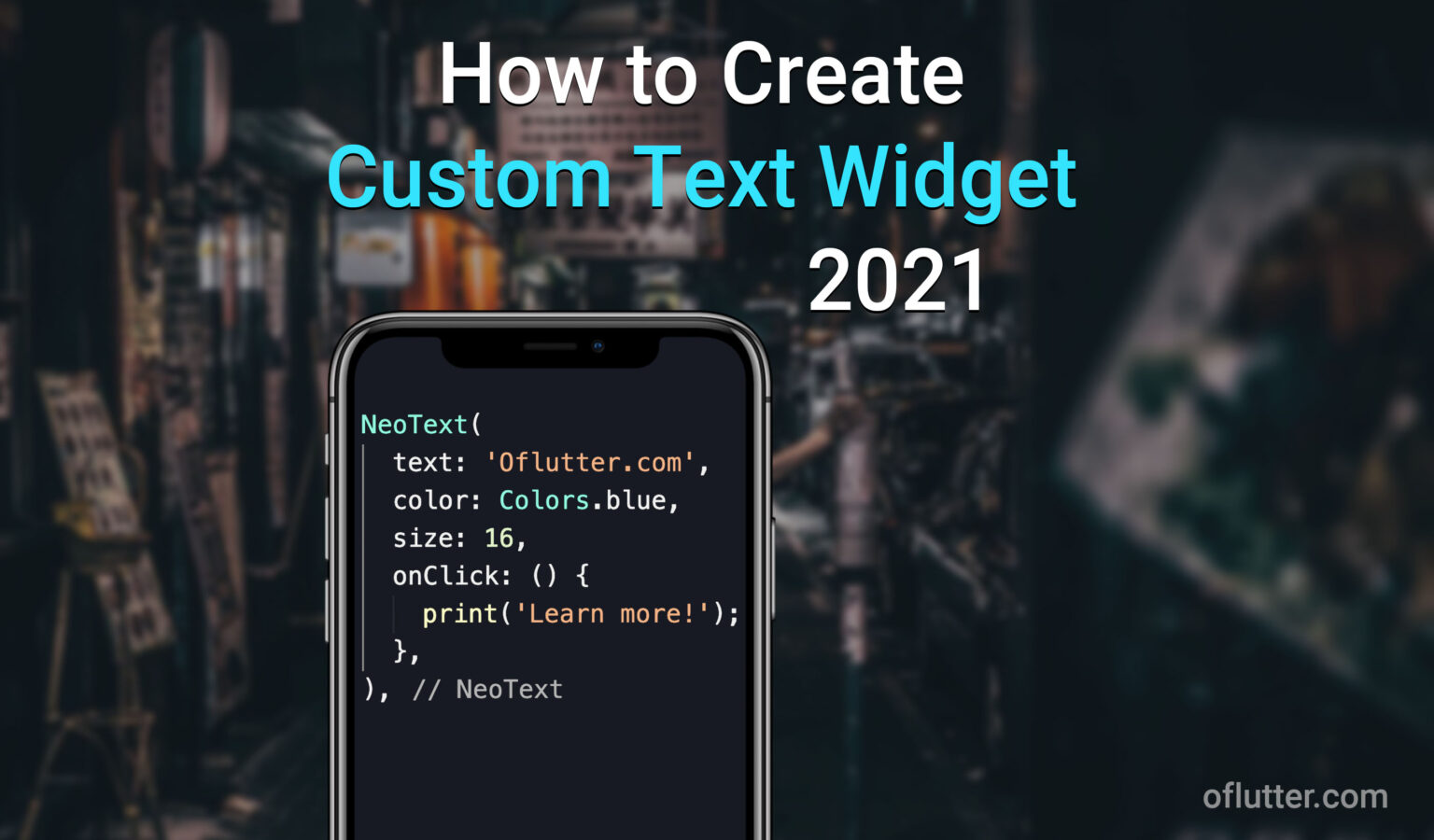
While developing the Flutter app, sometimes the code might get too messy, so it’s hard to read and maintain. This might happened not because the code is bad, or written poorly, it’s just the code that gets too large. In this article, I want to show you how to create a custom text widget and make it reusable.
You may ask: Why would I want to create a Custom Text Widget?
To answer this question, let me just show you an example. Assume that you are building the Flutter app, and you have a specific design pattern that is used over and over again in your Text Widget. For example, font-weight: 500, font-size: 17, default color is grey, and maybe sometimes you want to make the text clickable. This is what will most likely be without using Custom Widgets:

What if I tell you that you can create your own custom text widget so that the result would be exactly the same, but the length of the code will be dramatically decreased. Like this:
That’s much better! Right? Okay, I don’t want to waste your time with wording. Let’s just dive into coding!
Table of Contents
Step #1: Create NeoText Stateless Widget in Separated File
We want to have our custom Widget to be organized and reusable. To do so, let’s create a separate folder widgets inside our lib folder. And inside our widgets folder create a file neo_text.dart.
Your app structure should look like this:

Great! Now it’s time to create our Custom Text Widget. When you create your own widget, you can name it however you want. In my case, it will be – NeoText().
Let’s open neo_text.dart file and create a stateless widget with a name NeoText.
import 'package:flutter/material.dart';

class NeoText extends StatelessWidget {
  @override
  Widget build(BuildContext context) {
    return Container();
  }
}
Awesome! Now, it’s time to create important arguments for our NeoText widget.
Step #2: Create Text Arguments for NeoText Widget
Since our custom NeoText widget will be a better version of the Text widget, we need to create main arguments for our NeoText widget.
In our example, it will be:
- text – Text input
- size – Size of the text
- fontWeight – Font weight of the text
- color – Color of the text
- wordSpacing – Spacing between words
- onClick – On click even on the text
You can have much more arguments if you want. But we will keep it simple, so these are enough for this tutorial.
Add these arguments inside your NeoText stateless widget
import 'package:flutter/material.dart';

class NeoText extends StatelessWidget {
  final String text;
  final double size;
  final FontWeight fontWeight;
  final Color color;
  final double wordSpacing;
  final VoidCallback onClick;

  const NeoText({
    @required this.text,
    this.size,
    this.fontWeight,
    this.color,
    this.wordSpacing,
    this.onClick,
  });

  @override
  Widget build(BuildContext context) {
    return Container();
  }
}
Note: Make sure that the text argument is set as @required because this is an essential argument for our widget.
Grate! Now let’s build our custom
Step #3: Build NeoText Widget
In this step, we will build a NeoText Widget. Since our NeoText widget can be also as a TextButton widget, inside Container() widget we will first check if onClick argument is set.
For example:
- if you use NeoText(title: ‘Hello World’)
- Container’s child widget should be a Text() widget.
- if you use NeoText(title: ‘Hello World’, onClick: () => null)
- Container’s child widget should be a TextButton() widget.
import 'package:flutter/material.dart';

class NeoText extends StatelessWidget {
  final String text;
  final double size;
  final FontWeight fontWeight;
  final Color color;
  final double wordSpacing;
  final VoidCallback onClick;

  const NeoText({
    @required this.text,
    this.size,
    this.fontWeight,
    this.color,
    this.wordSpacing,
    this.onClick,
  });

  @override
  Widget build(BuildContext context) {
    return Container(
      child: onClick == null
          ? Text('')
          : TextButton(
              onPressed: () => onClick.call(),
              child: Text(''),
            ),
    );
  }
}
We have declared many arguments. Next let’s populate the Text() and TextButton() widgets with these arguments.
import 'package:flutter/material.dart';

class NeoText extends StatelessWidget {
  final String text;
  final double size;
  final FontWeight fontWeight;
  final Color color;
  final double wordSpacing;
  final VoidCallback onClick;

  const NeoText({
    @required this.text,
    this.size,
    this.fontWeight,
    this.color,
    this.wordSpacing,
    this.onClick,
  });

  @override
  Widget build(BuildContext context) {
    return Container(
      child: onClick == null
          ? Text(
              text,
              style: TextStyle(
                fontSize: size,
                fontWeight: fontWeight,
                color: color,
                wordSpacing: wordSpacing,
              ),
            )
          : TextButton(
              onPressed: () {
                onClick.call();
              },
              child: Text(
                text,
                style: TextStyle(
                  fontSize: size,
                  fontWeight: fontWeight,
                  color: color,
                  wordSpacing: wordSpacing,
                ),
              ),
            ),
    );
  }
}
Okay, that’s much better! However, we still did not finish our custom widget. If you have some custom design pattern, and it’s been used very often. You should set your own default parameters for the NeoText() Widget. For example, font-weight: 500, font-size: 16, default color is grey,
To do so, you should add ?? after the argument and set a parameter to that.
          ? Text(
              text,
              style: TextStyle(
                fontSize: size ?? 16,
                fontWeight: fontWeight ?? FontWeight.w500,
                color: color ?? Colors.grey,
                wordSpacing: wordSpacing,
              ),
            )
          : TextButton(
              onPressed: () {
                onClick.call();
              },
              child: Text(
                text,
                style: TextStyle(
                  fontSize: size ?? 16,
                  fontWeight: fontWeight ?? FontWeight.w500,
                  color: color ?? Colors.grey,
                  wordSpacing: wordSpacing,
                ),
              ),
            ),
By setting your own default parameters, you will only need to use NeoText(text: ‘My text’), without setting any additional arguments.
Step #4: Import NeoText Widget
Finally, after we finished building our custom reusable widget, you can import the widget anywhere in your project by using:
import 'widgets/neo_text.dart';or
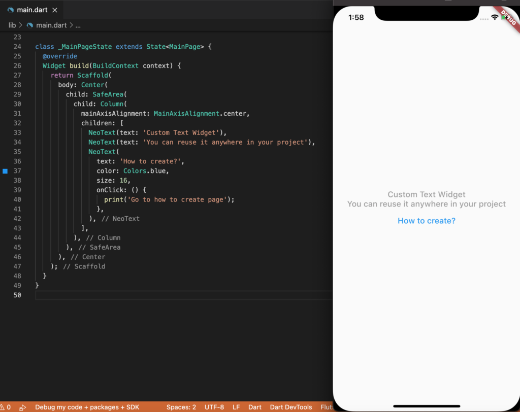
import 'package:[app_name]/widgets/neo_text.dart';This is an example of the main.dart file use case of our custom NeoText() widget:
class _MainPageState extends State<MainPage> {
  @override
  Widget build(BuildContext context) {
    return Scaffold(
      body: Center(
        child: SafeArea(
          child: Column(
            mainAxisAlignment: MainAxisAlignment.center,
            children: [
              NeoText(text: 'Custom Text Widget'),
              NeoText(text: 'You can reuse it anywhere in your project'),
              NeoText(
                text: 'How to create?',
                color: Colors.blue,
                size: 16,
                onClick: () {
                  print('Go to how to create page');
                },
              ),
            ],
          ),
        ),
      ),
    );
  }
}
And the result is:
Final Code
import 'package:flutter/material.dart';

class NeoText extends StatelessWidget {
  final String text;
  final double size;
  final FontWeight fontWeight;
  final Color color;
  final double wordSpacing;
  final VoidCallback onClick;

  const NeoText({
    @required this.text,
    this.size,
    this.fontWeight,
    this.color,
    this.wordSpacing,
    this.onClick,
  });

  @override
  Widget build(BuildContext context) {
    return Container(
      child: onClick == null
          ? Text(
              text,
              style: TextStyle(
                fontSize: size,
                fontWeight: fontWeight,
                color: color,
                wordSpacing: wordSpacing,
              ),
            )
          : TextButton(
              onPressed: () {
                onClick.call();
              },
              child: Text(
                text,
                style: TextStyle(
                  fontSize: size,
                  fontWeight: fontWeight,
                  color: color,
                  wordSpacing: wordSpacing,
                ),
              ),
            ),
    );
  }
}
Conclusion
Creating your custom widget is essential in Flutter development. Not only you write less code and save time. But new developers that come to work with you will be easy to read and understand the code. As a result, your project becomes more scalable, readable, and easier to maintain.


This is interesting! So I can conditionally render any type of custom widget huh?
Yes!